Tuesday, December 17, 2013

Two Worlds, One Emotion - Fear and Isolation


Here are the first two finished pieces of my new series. The upper photo represents the emotion of fear, while the lower one represents isolation.

Monday, December 9, 2013

New Series - Two Worlds, One Emotion


In this new series, I plan on having a man vs. nature theme. I want to use merging like before, but have my models represent a human emotion. For each photo I plan to use one model, but black out the background and put them together to look like they are in the same space. In this group of photos, the female is representing fear, while the male is representing isolation. Unlike my last series, I don’t plan on having a male and female represent one theme.


Friday, November 22, 2013

Tuesday, October 15, 2013

Summer 2013 Photography


Now that I’m back on my blog, I feel like it’s necessary that I update on some of the work I did over the summer.

Wednesday, October 9, 2013

The Supernatural Stories - A Secret Betryal


This photo will be the beginning of a new series I’m planning to begin. My series will be about ghosts and their interactions with the real world and the living. Each photo will have different themes to them, such as abandonment, loss of a family member, and revenge. Some of the other photos will be representing a cause of death such as poisoning, strangulation, and starvation. This photo in specific has a story that involved betrayal between both people in this photo that caused the model in the background to be strangled. I added the text and shadow to add to the sinister tone of the photo. In addition to the themes, I plan to add a small line of text to fortify the message within the photo.

The Double Mantis

 
          In this photo, I really liked that there is a chemistry made between both mantises. Each photo is very clear and contains great details of each insect. The change in background and lighting creates a different mood for each photo to make it feel like they’re in separate worlds. Yet, I felt that the image on the right could’ve been clearer and a bit more contrasted.


Thursday, June 6, 2013

Final Reflection


Having my work in a gallery show was so awesome! I loved how anyone could see your work and could even buy it. I was finally able to see everyone else’s work for the first time, so that was a treat for me. The advice I give to the upcoming AP Photo students is to think about what you want to do for a series throughout the year and when you get an idea, write it down somewhere. Also, be open to change. It is more than likely to happen when working on your series and it’s best to just go with the flow. I know super cheesy and cliché, but that’s honestly one of the easiest ways to get an awesome series. I loved the environment of the class. I enjoyed being around so many people with so many crazy artistic ideas, it truly brought out my creativity. Something I would’ve done differently this year would’ve been to even more photos and to get to know Photoshop and my camera a bit more. Before, I never saw myself as a photographer or even someone to use digital media as a form of art. Before this class, the only times I really used a camera was to film short videos and take pictures of the animals from the zoo. This year I learned that I really love photography, and that I’m pretty good at it! Because of this class I even plan to pursue photography and digital media as a career. I learned so many useful photography skills this year and I know that I am going to use them when pursuing photography in the future. I even plan to take photography for a second year, so watch out world! I’m not done yet.

Friday, April 12, 2013

Concentration Series Commentary


The main idea in my concentration series is the personification of the natural elements. I chose eight different elements to personify. I gave each element a male and female form to make each one more real and create a little story for every element. My personal connection to this series is that I like to view the natural world as an equal. The principles of design I used are texture, contrast, and color. I wanted to explore this idea because I wanted to experiment with elements and people.

When I was starting my concentration series, I was originally taking pictures of scenery related to that element, such as taking pictures of the ocean for the water element. Yet while I was doing this, I felt like my idea was really lackluster. I thought about adding a sense of fantasy to my photos, so I decided to merge the pictures of scenery with a model that represents a specific element. By having a male and female version of every element, I could create a story within each pair of elements. I originally planned to have five elements, but soon I added the elements of light, dark, and metal to increase the amount of photos I would end up with. Since I had to merge photos to create my elementals, I heavily used Photoshop to make my ideas come to life. I greatly increased the contrast on more than half of my photos to bring out the facial features of my models. I utilized texture in my photos because it would give my photos more depth to them and not make them look flat and boring. Adding analogous colors to each set of elemental photos further grasped my concept of making each element life-like. My series began as a way to see our world more clearly, but after finishing this project, I realize I allowed the viewer to see a different perspective of our world and that everything around us is our equal.

Friday, April 5, 2013

Week 6


                This was such a hectic week for me. Unlike previous weeks, this week consisted mainly of me being on Photoshop, merging all the models I used last week with their corresponding element. I also had to get photos of myself taken so I could merge them with the element I chose for myself. I’m aware that we were supposed to have only twelve images, but there were some extra images I had to include in here. I made a few diptychs of certain elements because I thought that they would work very nicely together. Also, due to the large amount of elements included, having a diptych or two would allow all the elements I chose to be included. The order I placed them is set very similar to a spectrum. I started the series with the light elemental and ended it with the dark elemental. The elements in between have a closer spot to either light or dark depending on the characteristics of that specific element, such as fire being closer to light because it is luminescent,  provides warmth, and helps during colder times, unlike metal which is cold and sharp. Each model I chose shows an aspect of each element they represent like the models of fire are very young and full of energy, whereas the models for nature are very elegant and seem to be mystic, like forest fairies. I decided to only do one blog post this week because I wanted to showcase all my final pieces all at once and not have my final week split up into segments. I very much enjoyed working on this series, and I just love how I gave each of my elements their own twist with a bit of my own personal style and thinking incorporated in each one.


Friday, March 22, 2013

Week 5.3


The end of this week was the busiest part of the whole week. Just today I think I had five or six photo-shoots. I’m so grateful that each photo-shoot 
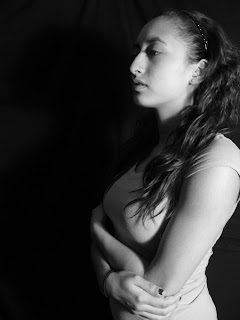
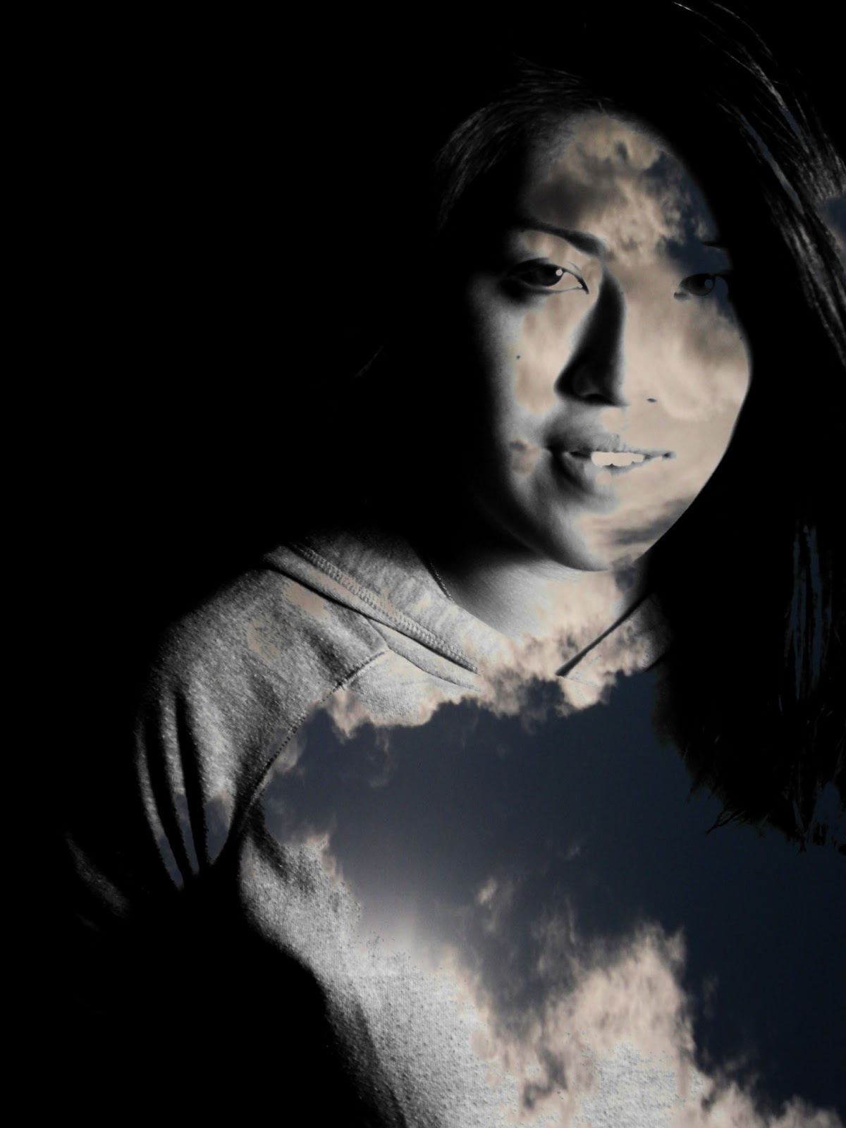
was a success. The images above are the base models for the fire, water, earth, metal, and light elements. For the fire element, I wanted a guy who was very energetic and bright, one always full of joy. For water, I wanted my model to imitate or mirror the pose my female model had. For both earth elementals, I decided to take an alternate approach to it. I didn’t go through the obvious route of having muscular brutes as my model, but people that would represent honorable warriors or tribesmen. My metal model initially was supposed to portray a classy cold figure, but in the end I decided to make appear cold and calculating, while still remaining a bit classy. For the light element I am planning to use only one model. She will be, along with darkness, an element that isn’t paired up with an exact copy. The reason for this is that I want to pair up the light and dark elements since they are very similar, but very different at the same time. For my light elemental, I wanted her to be very innocent and very cute, which will greatly contrast the dark elemental. Over the break I will probably take photos corresponding with light, darkness, and metal, I would also like to get more fire pictures and some extra water shots, as well.