The main idea in my concentration
series is the personification of the natural elements. I chose eight different
elements to personify. I gave each element a male and female form to make each
one more real and create a little story for every element. My personal
connection to this series is that I like to view the natural world as an equal.
The principles of design I used are texture, contrast, and color. I wanted to
explore this idea because I wanted to experiment with elements and people.
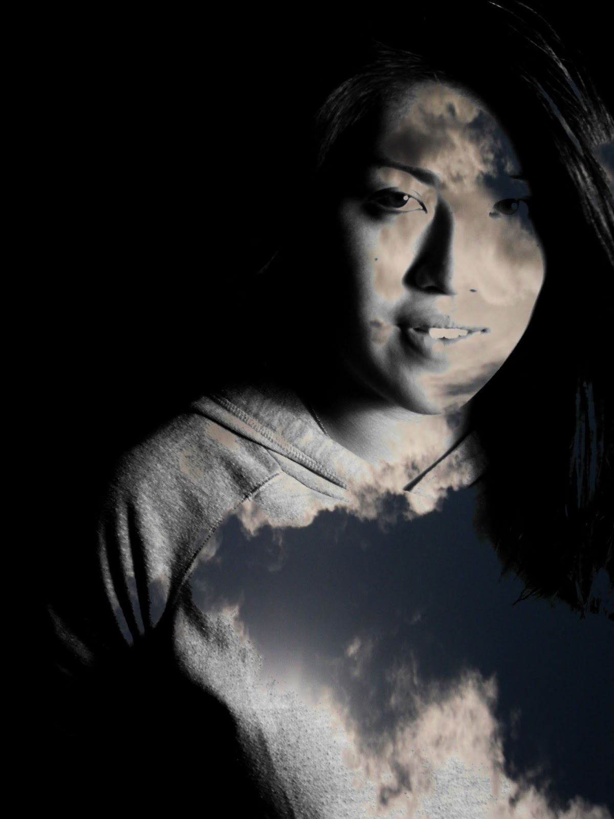
When I was starting my
concentration series, I was originally taking pictures of scenery related to
that element, such as taking pictures of the ocean for the water element. Yet
while I was doing this, I felt like my idea was really lackluster. I thought
about adding a sense of fantasy to my photos, so I decided to merge the
pictures of scenery with a model that represents a specific element. By having
a male and female version of every element, I could create a story within each
pair of elements. I originally planned to have five elements, but soon I added
the elements of light, dark, and metal to increase the amount of photos I would
end up with. Since I had to merge photos to create my elementals, I heavily
used Photoshop to make my ideas come to life. I greatly increased the contrast
on more than half of my photos to bring out the facial features of my models. I
utilized texture in my photos because it would give my photos more depth to
them and not make them look flat and boring. Adding analogous colors to each
set of elemental photos further grasped my concept of making each element
life-like. My series began as a way to see our world more clearly, but after
finishing this project, I realize I allowed the viewer to see a different
perspective of our world and that everything around us is our equal.


